A client said to me last week, “We’re trying to keep it simple, so we started using one form for all of our landing pages — but that doesn’t work, does it?” No, it doesn’t. . . but that begs the question of how many forms you actually need, and how to know when to use which form.
Another client has over a hundred forms, with strange names like R354B7-PPC-Star Profile Cutters. The name suggests that this form was created for a PPC campaign for some product — but can this form be reused for something else? And with a name like that, would it make any sense when this form is used for something else?
Let’s take a look at how to develop a strategy for form creation, naming conventions, and multiple uses for a single form (after all, why make our marketing any more complex than necessary?).
Map your content offers to the buying process
To best utilize forms, start by mapping your content offers to your customers’ buying process (extra credit if you’re using buyer personas). @ChrisLoDolce, a HubSpot Customer Training Professor, recommends creating a framework for your forms based on two criteria:
- Type of offer (i.e. whitepapers, ebooks, webinars, demos, checklists, etc.
- Stage in the buying process (i.e. TOFU, MOFU, BOFU)
This may take some up-front time, but it will minimize or eliminate future form creation work and confusion.

This minimizes the number of forms necessary, while still allowing for customizarion of the submit button to be relevant to the offer, and having the appropriate number of fields for where the lead is in the buying process.
Sample forms for each step of the buying cycle
Using a three-stage buying cycle, let’s look at some sample forms and understand what fields might be useful. Keep in mind that these are merely samples to stimulate your thinking. You’ll need to go through your own content mapping process to build useful forms for your landing pages.
Top of the Funnel (TOFU): Prospect is researching
Examples of this type of form include downloading whitepapers, tip sheets, ebooks, or checklists. Consider keeping your forms short for these offers — your real goal is simply to get the visitors name and email address, so you can start a conversation. Ask for the bare bones information you need to send a relevant email to this prospect. You can always get more information on the prospect’s next visit.
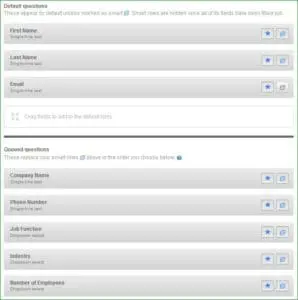 This form allows you to ask just three simple things at first: first name, last name and email address. Easy, and low-risk for your prospect.
If the same prospect comes back and converts on something else that uses this form, they will be asked for their email address, company name, phone number. And a third time, they would enter their website URL and number of employees. You can learn more and more about your prospect as they engage with your information over time.
These fields help you segment you database and tailor your communications to your prospect’s role and needs.
Once you identify which form fields you’ll be using, create your first form. Name it something like “Perform Research – Ebook.” Now it will take only a few seconds to clone the form (named “Perform Research – Checklist”) and change the “Download Ebook” submit button to “Download Checklist.” Now every TOFU offer for an ebook can use the same form, and every TOFU offer for a checklist can use its own form.
Middle of the Funnel (MOFU): Prospect is establishing their buying criteria
Examples of this type of form are registering for a webinar, downloading a case study or a guide, or requesting a free sample. This form can be a little longer, maybe 4-7 fields as these offers are perceived as more valuable. Focus on capturing information that is useful for further marketing to this person.
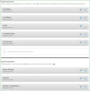 Once you create this form, you can simply clone it to rename it and update the submit button to match the offer. You might name this form “Establish Buying Criteria – case study.”
Bottom of the Funnel (BOFU): Prospect is evaluating vendors
BOFU forms are used for offers like a price request, quote request, demo request, free trial, or free consultation. These are common offers that indicate a prospect is evaluating different vendors and about to make a decision of which vendor to use.
This form will most likely have 8-15 fields, as you want to make sure you capture all the information that Sales needs to close the lead into a customer.
If you’ve been using progressive profiling for all of your forms, you may find that you have most of the information you need by now, so the only fields that will show up are email and the fields that have never been answered.
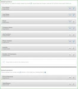 You may find that at this stage in the buying cycle the form field requirements have changed a little bit. Simply close the Evaluate Vendor form and make the changes you need.
How many forms do I need?
You really need three standard forms, as outlined above, and then you can clone each form as needed to crate the appropriate submit button and make any other small changes you want.
A few closing tips to keep in mind:
- Use progressive profiling if you have it available. It simply saves time and helps build your knoweldge about each prospect faster, and with less “friction” from your web visitor.
- Consider requiring every field on your form. Keep the forms as short as possible, and your visitors won’t have as much resistance to required form fields.
- Always have email be a required field even if you already have the email for that prospect. Simply being asked for Number of Employees, for example, without putting in your email address, is pretty weird. If asked for an email address first, people will understand that you’re associating their answers in other field with their email address.
- Once you’ve adopted a naming convention for your forms, be sure to train anyone who might be creating forms to use the same convention.
- Always go back to your three basic forms and clone them to make a new form if you need something a little different.
While it’s great to have mutliple landing pages, and even multiple pages for the same offer (more options for social media content, more pages in Google), you don’t need to create a new form for every landing page. Build off this model of TOFU, MOFU, and BOFU forms, and then adjust each clone as needed.


